
I once sat through the first half of Wicked, waiting for the big reveal. Which of the characters was about to become the Wicked Witch of the West?
At the interval, my wife spoiled it for me. There was no reveal, it was the green one.
“There’s a green one?”
My name’s Dave and I’m a colour-blind designer.
There’s no shame in being colour-blind. Or in being a designer. Mostly. But tell people you’re both and many will turn their head like a Labrador hearing a balloon whine.
The basic view of a graphic designer is someone who ‘colours in for a living’. And can you really specialise in something if you can’t even see what you specialise in?
But colour-blindness is surprisingly common – 8% of men across the world are affected, though only 0.5 % of women.
And I believe it gives me an advantage as it has given me a far greater understanding of the importance of accessibility in design, particularly around colour.
Here are some tips from my personal experience that could help make your work more accessible and gives us colour-blind types a better understanding of what you’re hoping to convey:
-
Define your differences
When creating wayfinding, graphs, guides or designing mapping, using colours can be extremely difficult for colour-blind people to follow. I find differentiating between pastel colours the most challenging. Primary colours are often easier to tell apart, so make the most of the colour wheels and colour guides that can steer you towards bold, contrasting colours that don’t need to be an eye-sore.
Primary colours still present problems of their own as they’re still reliant on that one method of conveying your message. The more colours you add to break things down, the harder is becomes to differentiate. The smaller an area is, the harder it is to discern the colour. And let’s not forget that primary colours will still prove to be problematic for those with monochromatic vision…
-
There’s no such thing as ‘one size fits all’… or is there?
I always found the London Underground map particularly difficult to follow growing up as it relied so heavily on colour. I usually made notes before taking a trip to London to avoid confusion. In 2013, Transport for London (TFL) introduced a colour-blind friendly app to help those with colour-blindness and other visual impairments and breaks the tube maps down using patterns, greater contrast and a zoom function.
This highlights another option – using numbers or symbols and other design elements that don’t solely rely on colour to get your message across.
-
The day-to-day
Like Hank Scorpio once said in The Simpsons:
“It’s the little things that make up life.”
And it’s those little things that can cause frustration for those who perceive the world with a more limited colour palette. Case in point: the standby light on my TV looks the same colour to me as when it’s on, so I spend about 30 seconds repeatedly mashing the button, trying to figure out which state of being it’s in.
Pretty much everything that uses LED lights relies on a red/green distinction. Perhaps it’s time to move on from the classic ‘stop/go’ approach. Make the lights blue and green or blue and red and the problem’s solved.
-
Blind spot
If colour is a key part of a job you’re working on and is part of a guide or a key or any essential information, find out if it works for a colour-blind person. If you know someone who’s colour-blind, ask if they’d be happy to take a look at what you’re working on.
Be sure to avoid pointing at things and demanding they tell you what colour they are.
Not gifted with a trusted colour-blind colleague or friend? You do have other options like the Color Oracle (colororacle.org) – a free colour-blindness simulator that can show you how people with colour blindness may see your fabulous creations. There may well be other alternatives.
Right, I’m off to the theatre. My wife’s bought us tickets to some musical called ‘Joseph’. Wish me luck!
Dave Molyneaux is the Creative Lead for Hampshire & Isle of Wight Fire and Rescue Service
Have another look at our roundels above, the surrounding bubbles show the colour choice appearing very differently if you are colour blind affected.
We did some experimenting with our blog banner design to show what it looks like for those experiencing colour blindness, the difference was a real eye opener …
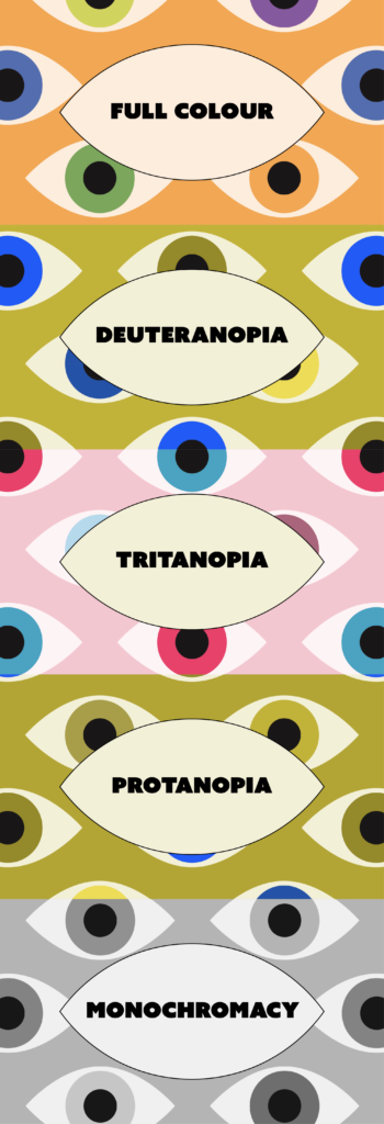
- Our original, full colour banner with orange background and multicoloured eyes.
- Simulation of our banner as seen by those with deuteranopia, a type of green colour blindness characterised by the inability to distinguish red and green pigments.
- Simulation of our banner as seen by those with tritanopia, a type of colour blindness where a person cannot distinguish between blue and yellow colour.
- Simulation of our banner as seen by those with protanopia, a type of colour blindness in which the red tones are absent.
- Simulation of our banner as seen by those with monochromacy, a type of colour blindness where a person cannot distinguish between any colours.